How To Render data clusters in Mapify
May 27, 2022
Mário Sobral

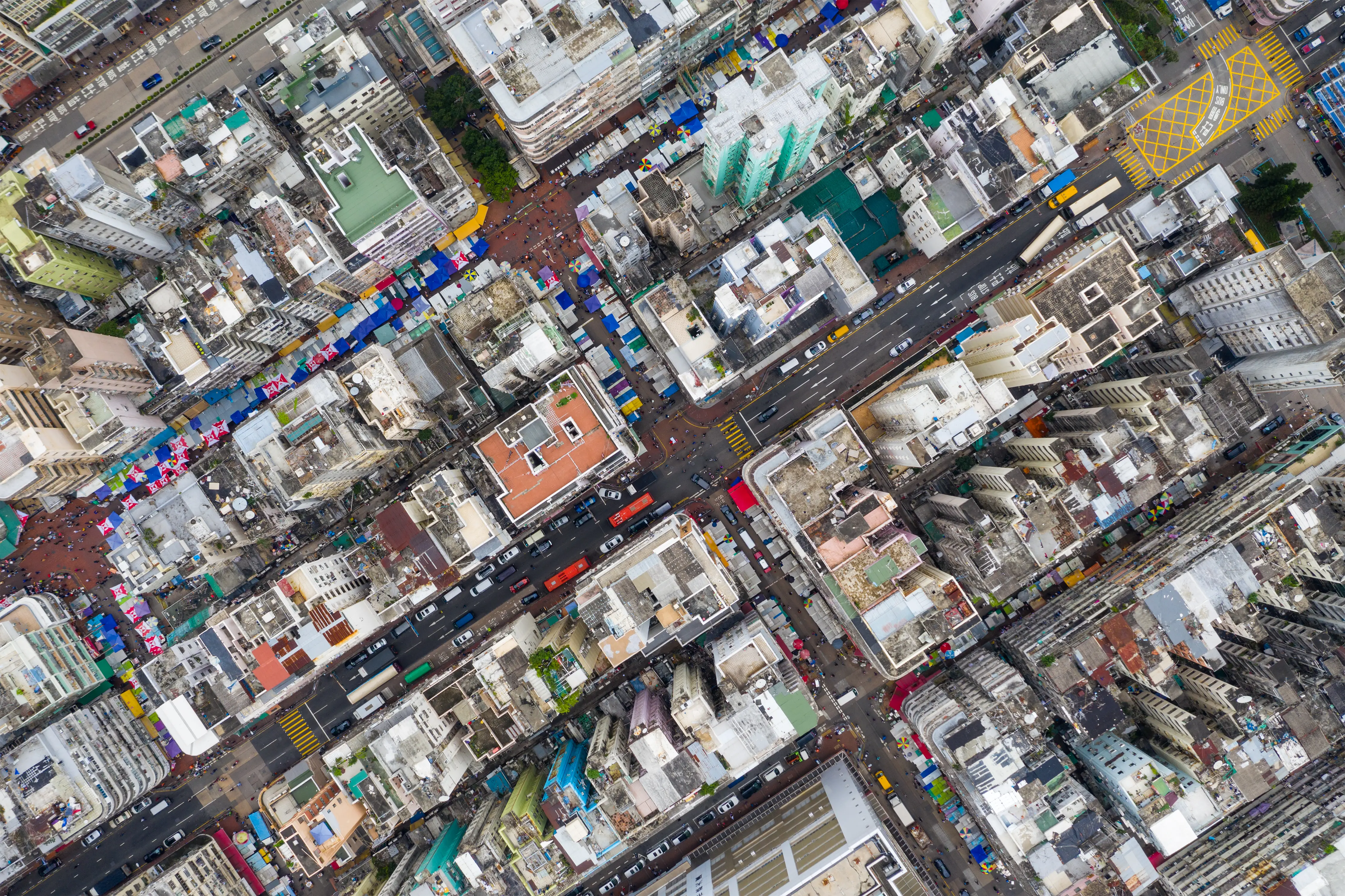
Most platforms that handle large volumes of data are faced with the challenge of presenting the user with meaningful information from millions of distinct data points. When those data points require a geospatial representation, there is an additional layer of complexity for human analysis. This is quite common in big data scenarios.

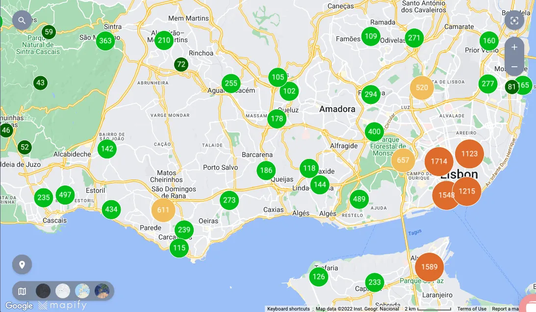
One of the approaches that Mapify provides to render large sets of data in a map is by the use of clustering. Mapify users can now easily define rules to visually aggregate data points in clusters, improving readability.
How do clusters work in Mapify?
Clusters work by grouping nearby data points into circles with the affected data points count at their centre.
A cluster styling rule allows the user to specify the styling for a specific interval:
- Size, colour and transparency of the stroke and fill of the circle
- Size and colour of the font for the data points total label


You can also define a default styling for any points quantities that fall outside the values defined by the styling rules intervals. Alternatively, you may allow the styling to fall back to the default rendering for single data points.

Real-time data clusters
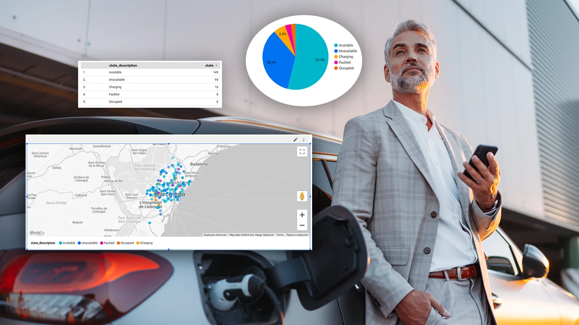
Clustering works for all kinds of point layers, including real-time layers. Clusters will adjust automatically according to the underlying data updates and reflect the current status of data.

We are constantly improving Mapify and cluster styling is one of our most recent features. If you want to be part of the journey and provide valuable feedback while building your maps, feel free to sign up for Mapify's free trial at mapify.ai/trial.


.webp)


